I'm trying to modify look and feel to make it closer to macOS (i just having fun with that idea), including perfect font rendering. Let me know if you're interested in details.
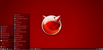
Wm: Mate
Look at the screenshot, that's what the neofetch window is for.would've been nice if you started by mentioning the WM you use for that.
That's really cool! Good work.View attachment 22660
I'm trying to modify look and feel to make it closer to macOS (i just having fun with that idea), including perfect font rendering. Let me know if you're interested in details.
Wm: Mate
") I actually like simplistsic but sometimes i want the familiarity of my Windows Desktop whenever i work in a gui environment. I have been using compton, openbox and lxpanel but i hate the fact that so many desktops are blue and gray. I am starting to hate blue. I moved to red since it is my favorite color and it happens to match the FreeBSD colors.
I actually like simplistsic but sometimes i want the familiarity of my Windows Desktop whenever i work in a gui environment. I have been using compton, openbox and lxpanel but i hate the fact that so many desktops are blue and gray. I am starting to hate blue. I moved to red since it is my favorite color and it happens to match the FreeBSD colors.Indeed. Many usability guidelines warn against red (it makes people feel anxious, angry, etc). However I also like a nice deep red, almost maroon.I am starting to hate blue. I moved to red since it is my favorite color and it happens to match the FreeBSD colors.
Hi kpedersen, i do agree that bright red on a black background is awful on computer screens.Indeed. Many usability guidelines warn against red (it makes people feel anxious, angry, etc). However I also like a nice deep red, almost maroon.
I think dark gray and dark red works nicely together (as seen in my ancient post here).
Agree. That's why I use some orange shades. It's not as cold as blue, or boring as grey or black. You may also try green, or - don't laugh - (dark) pink.Many usability guidelines warn against red

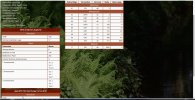
Well, that's where the interesting hardware specs are.By the way I don't look much at those neofetch windows.
speak for yourself, i get plenty of work done.The [G]UI is for to improve work efficieny, not for to look "cool" or impress your buddys.
I think that if someone is distracted by their choice of desktop settings, then that someone must not be happy with their job. I MUST listen to music when i program (which is why i would never program for a living). I get plenty of work done, vide my attachments. And i am self-educated (my menu colors didn't distract me from learning either). You and me both!why in the hell does anyone want to browse the web on a tiny phone screen over a desktop? good Lord! yet, all of that eye candy on those phones must be quite distracting and addictive.


Because I do have exactly that... ?I know. But why should I care if someone uses a AMD ryzen 5 with 32GB?

")
Well, if I shop on Amazon or hang on on Forums, I use a laptop. For things like espn.com, or weather, I use my phone. I have a Galaxy a51 that I got for $200 USD at walmart.com, and it's got everything I expect out of a phone - battery, reasonably big screen, good antennae for phone/wifi/Bluetooth - no need to blow $1k and up to get all that, and I've had it for 4 years already, because I saw no need to upgrade.It's like cell phones to me: why in the hell does anyone want to browse the web on a tiny phone screen over a desktop? good Lord! yet, all of that eye candy on those phones must be quite distracting and addictive. Have you seen the prices of some of these 'smart' phones? one could have a gaming pc with 1920x1080 screen. LOL
well, pink is really faded red. I like pink. Why would anyone laugh at a pink color choice? not liking a color is normal but discrimination is a whole other topic. I use pink often because it is soft and easy to look at. Pink flowers are very pretty and some butterflies and moths are pink and it is very pretty. I have started to build a second theme just for you: Pink-PetalAgree. That's why I use some orange shades. It's not as cold as blue, or boring as grey or black. You may also try green, or - don't laugh - (dark) pink.
I refuse to build websites for phones. In fact, i have a line for phone users on my w-i-p website: This website requires the use of laptop or desktop computer with a wired internet connection. I simply do not care about phones. Personally, phones are to be used for telephoning and portability is a nice feature but web surfing is like using a fork to eat pudding instead of a spoon.
so are you requesting a Hello Kitty theme?Wikipedia is fun to browse on a phone, BTW...
I'll work on that in the future. I am being serious too. I've started a Pokemon (tm) theme but i'm not even finished with Ruby-Slippers. I'll add Hello Kitty to my list.

My gf is a huge "Hello Kitty" fan so I'm defintiely going to be pointing her attention to this.so i've started working on a Hello Kitty theme. I had to create an svg of the character's head to use as a menu button and i created a custom Hello Kitty panel image. Any other requests? LOL.
Nice! I name my stuff after games and had Hexen/Doom/Heretic for a bit. Path of Exile had some interesting names, and I liked that bandit trio for 3 serversThing about me? I'm a geek/nerd and I also happen to enjoy anime. So it didn't take long before I heavily started using anime (related) names for my servers.
My router hostname is Wraeclast Cool naming scheme! I was thinking Final Fantasty with DragoonZefiris is one of the main characters and also a huge favorite of mine. She's a so called "Dragoon" => an artificial being build by mankind to help fight off an alien invasion. In my opinion... Zefiris is to 'Scrapped Princess' what Rei Ayanami is to 'NGE': totally awesome yet also kinda disturbing at the same time.
Within the context above: "Zefiris" is my main server... 2 cpu cores, 4Gb of memory and 100Gb storage. Unlimited data. "Dragoon" is my backup server, you can see the specs above. The main purpose is MX backup, but I'm also planning on doing some mirroring back and forth (like my PostgreSQL database), and it's also going to be used as a bit of a DMZ for "semi-offline" backup storage as well.
(that's my favorite class on FFXIV)14.3 is shipped? Just dropped to my knees