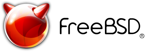
The actual FreeBSD logo

Hi! I open this thread to talk about the actual FreeBSD logo.

When I present FreeBSD operating system to my friends, all of them say the FreeBSD logo looks horrible. Personally, I think the same; the traditional Beastie logo looks nicer and friendlier than the actual one. What do you think about it?
 
Last edited:
Kalero, I agree. My favorite two illustrations are the original John Lasseter drawing you're using for your avatar, and this one (I'm guessing this was also drawn by John Lasseter, but I'm not sure):

bsdshirt.jpg
 
I love the beastie bobble-head. Simple (and small), clean, and modern. Works perfectly with adverts, slides, brochures, etc.
 
Maybe it's a marketing question, but Linux community keeps the original Tux (the penguin) logo and it "works" for them. I think we should do the same, not because Linux community keeps the original logo, but to show a friendlier look.
 
Last edited:
I've heard people refer to the old one as "Beastie" and the new one as "the orb". That makes them easy to distinguish.

I'm a little nostalgic for Beastie, so I add loader_logo="beastie" to /boot/loader.conf. Also, I guess everyone has seen the image of Beastie performing an indecent act on Tux. The orb can't do that. :p
 
Back when the "new" logo was being proposed, there were some people claiming it looked exactly like a sex toy, complete with images.

I've never been able to look at the logo and not think of that ...
 
Look at the image I am using for my avatar. Now remove the horns. Maybe with a little more touch up it would look like a sun/star with solar flares coming from it. IMHO that would make a cool new 'next generation' logo. But I am not saying that I think the current artwork needs to be replaced.
 
I'm sure there has been posts previously from people strongly against the Beastie drawing due to the demon reference, regardless of how silly it seems to most people (including me). The Orb has horns as well of course but is at least a bit more abstracted.

Yes Linux has Tux, but every real Linux distribution has professional (or at least slightly more professional) logos.

Some people don't like the simplified style of modern logos, but as mentioned by Beastie7, it needs to work well in all sorts of situations, including those where colour or resolution are in short supply. In some situations, like the corner of a document/flyer, or an application icon I think the Orb would look fine, even it it's just the outline without the 3d effect, but the Beastie drawing would just look childish (IMHO).

Maybe with a little more touch up it would look like a sun/star with solar flares coming from it. IMHO that would make a cool new 'next generation' logo
Sounds like something I would of thought was cool on a website in the 90's.

You know what really needs a redesign? The FreeBSD website.
Yeah I've thought that for a while. There's a mention in the latest quarterly update that some changes have been made to reduce space waste. I can see why they've done it but I think it's made it slightly awkward looking (especially the front page). They do mention redesign as an option, but say "that is a much more complex and ambitious project than it might seem"
 
I've always thought the new orb logo, looks like the designer was a Pepsi drinker and took the Pepsi logo, put on a red overlay and added horns. Don't like it, personally.
 
Probably did. A lot of logos seem to be heavily based on someone elses.
I personally think the new iXsystems logo looks exactly like the HP logo, squashed into an oval a little bit, with "HP" replaced by "iX". It's even a near identical blue.

I don't think the Orb is perfect, but I do think simple logos are far more usable. I really don't think the Beastie can be used as one.
 
...but the Beastie drawing would just look childish (IMHO).

I prefer the new one, but I do not care much. If I have to put a freebsdFreeBSD logo on a website (or a program icon), I use the new one, it's simple, it's circular (fit everywhere), most of times I use the 'flat' one (no 3D and 1 color: most of time red, but in many cases light or dim gray or black). Whatever the logo looks like doesn't matter to me, it should define the FreeBSD OS at first look. Even better there's no need to look at it, your subconscious see it and inform you.

I agree with usdmatt, anyways.
 
Yes Linux has Tux, but every real Linux distribution has professional (or at least slightly more professional) logos.

Some people don't like the simplified style of modern logos, but as mentioned by Beastie7, it needs to work well in all sorts of situations, including those where colour or resolution are in short supply. In some situations, like the corner of a document/flyer, or an application icon I think the Orb would look fine, even it it's just the outline without the 3d effect, but the Beastie drawing would just look childish (IMHO).

I agree with the argument that logo needs to be something easy to include in many situations (documents, etc.), but also I think a brand's logo should be something that people feel identified with. And I think the orb logo is too unsightly, a failed attempt to "modernize" the traditional mascot. It's true that, while Linux keeps the Tux (the penguin) logo, most distributions use their own logo but, in many cases, they just use stylized letters showing the distribution's name or, in other distributions that use a stylized mascot, such as SuSE's chameleon, the mascot looks much more friendly, not like the orb logo that, IMHO, looks impersonal, boring and unsightly (what is the sense of an faceless orb with horns?). I think the FreeBSD stylized letters "work" for the purpose of having a logo easy to use for many situations (or maybe with something more symbolic like... a drawing of a fork?), but the logo/mascot of FreeBSD must be something that people feel identified with, and I think the traditional Beastie is the perfect one, like Tux in the Linux world.
 
Last edited:
Back
Top