Visited the official site. Still confusing, but if I understand correctly, the final results are shown as text with escape sequences.Sure. As is probably done with this by handing it off to Firefox. But then why not just use Firefox?
Absolutely but that's a graphical thing which makes it not text based.
That would look like playing games on an Atari 800.You can display movies as ASCII art in a pinch.
That kind of cracks me up.That would look like playing games on an Atari 800.

Exactly.That would look like playing games on an Atari 800.
I had a lot of fun back in the day with Pong.Exactly.
FreeBSD is an operating system for a variety of platforms which focuses on features, speed, and stability. Derived from BSD, the version of UNIX® developed at the University of California, Berkeley, it is developed and maintained by a large community since 1993.
I have to agree with this and I complain about it often, elsewhere, about software upgrades and introductions where a link is given to the homepage that doesn't define--in any way, shape, or form--what the software does.if I'm a newcomer, I need to know this is not a Linux.
Here's a thing - if I'm a newcomer, I need to know this is not a Linux. And nothing on the front page points to it. Check QubesOS site, it looks same in principle. Check any Linux that doesn't use Linux in the name and it will look the same.
The front page needs to include the text from About section, I would slightly rewrite it
This is far more valuable "at a glance" info than having its own FS, hypervisor, network stack, documentation, whatever.
It's 2026 anyone can "have anything" especially in presentation.
Put another box like "Longetivity" or a better word and place the About text in there, below all other boxes.
Once somebody finishes "glancing" at those features he gets to read how this is a 30+ year old project. Not a joke. In my view it cements faith in the features above.
personal opinion here, dark vs light themes. Younger me was better with light background or "black letters on white paper". Middle aged and older me are "Dark background with lighter foreground". Old VT100's that were green text on black were what I started with, but now 40 yrs laters, are what is easy on the eyes.Instead of white maybe grey or dark red background should be better for eyes.. this is just a mockup..but current BSD home page looks pretty enough, and simple.
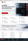
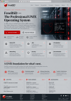
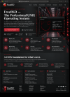
And one more thing, for those coming on site for the first time..they will search for BIG Download button (literally)..if they see amd64 etc..they wont know what to choose (there are still people struggling with this) I know that amd 64 is right iso, but some newcomers will just stare so this download button by default when clicked, could show amd64 ISOs list, but if you want other iso there is a small arrow on the button to select from.Thank you..i just wanted to share this concept in light and dark variants, with unix/server accent, who knows, maybe it will be useful for future design.Matthew45 Your mockups look really "appetizing" (at least for my taste)
Thanks! I came up with the overall concept and direction, and I used AI to help visualize it. My idea was to make the FreeBSD homepage look cleaner and more professional, while making it immediately obvious to someone coming from Linux, Windows, or macOS, that FreeBSD is a serious UNIX operating system.Matthew45 I'm on my phone but I think I love it. Is that your design or AI or what?