N
Nicushor
Guest
I have two systems, and Linux Mint looks way more cleaner and well done. What is the reason for this? How can I make BSD look more like Mint or any other Linux?


Disclaimer: Questions about 'derivative FreeBSDs', like PC-BSD should be asked on the forums and/or mailing lists for these specific products.
Topics about PC-BSD | FreeNAS | DesktopBSD | m0N0WALL | pfSense | Debian GNU/kFreeBSD
It's worth to read the following thread related to your question.
https://forums.pcbsd.org/thread-15144.html
Why is this a problem?
Hmm. First of all you are comparing two different desktop environments. Install MATE on the PCBSD system and then do a comparison. The moderator is also right. This isn't PC-BSDs forum.
Perhaps this is a stupid question, but the recognised screen resolution is the same on both OSes?
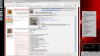
Yeah, I had already noticed.These are images from Google, not my own screenshots.
") I was wondering if the text looks ugly for a screen resolution problem rather than other.
I was wondering if the text looks ugly for a screen resolution problem rather than other.Yeah, I had already noticed.
Apart from this, have you already checked if your DE (KDE, MATE... which one is irrelevant) has correct settings for antialiasing?
<?xml version='1.0'?>
<!DOCTYPE fontconfig SYSTEM 'fonts.dtd'>
<fontconfig>
    <match target="font">
        <edit mode="assign" name="antialias">
            <bool>true</bool>
        </edit>
        <edit mode="assign" name="hinting">
            <bool>true</bool>
        </edit>
        <edit mode="assign" name="hintstyle">
            <const>hintslight</const>
        </edit>
        <edit mode="assign" name="lcdfilter">
            <const>lcddefault</const>
        </edit>
        <edit mode="assign" name="rgba">
            <const>rgb</const>
        </edit>
    </match>
</fontconfig>
ln -s /usr/local/etc/fonts/conf.avail/70-no-bitmaps.conf /usr/local/etc/fonts/conf.d/70-no-bitmaps.confWhat solved my own font rendering issues:
- Create /usr/local/etc/fonts.d/99-desktoprc.conf ...
- ... setting them up as default fonts by saving https://raw.githubusercontent.com/t...desktoprc/files/99-desktoprc-croscore.conf.in as /usr/local/etc/conf.d/99-desktoprc-croscore.conf
<?xml version="1.0"?>
<!DOCTYPE fontconfig SYSTEM "fonts.dtd">
<!-- $XDG_CONFIG_HOME/fontconfig/fonts.conf for per-user font configuration -->

<fontconfig>

  <!--
  Private font directory
  -->
  <dir prefix="xdg">fonts</dir>

  <!-- Replace Courier with a better-looking font -->
  <match target="pattern">
  <test name="family" qual="any">
  <string>Courier</string>
  </test>
  <edit name="family" mode="assign">
  <!-- Other choices - Courier New, Luxi Mono -->
  <string>Bitstream Vera Sans Mono</string>
  </edit>
  </match>

  <!-- Reject bitmap fonts in favour of Truetype, Postscript, etc. -->
  <selectfont>
  <rejectfont>
  <pattern>
   <patelt name="scalable"><bool>false</bool></patelt>
  </pattern>
  </rejectfont>
  </selectfont>

  <!--
  <match target="pattern" >
  <test name="family" qual="any" >
  <string>Helvetica</string>
  </test>
  <edit binding="strong" mode="prepend" name="family">
  <string>Arial</string>
  </edit>
  </match>
  -->

  <!-- default quality settings -->
  <match target="font">
  <edit mode="assign" name="rgba">  <const>none</const> </edit>
  <edit mode="assign" name="antialias"> <bool>true</bool> </edit>
  <edit mode="assign" name="autohint">  <bool>true</bool> </edit>
  <edit mode="assign" name="hinting">  <bool>true</bool> </edit>
  <edit mode="assign" name="hintstyle"> <const>hintfull</const> </edit>
  </match>

  <!-- reduce ringing ==> requires freetype2 'WITH_LCD_FILTERING=yes' -->
  <match target="font">
  <edit mode="assign" name="lcdfilter"> <const>lcdlight</const> </edit>
  </match>

  <!-- disable autohinting for bold fonts -->
  <match target="font">
  <test compare="more" name="weight">  <const>medium</const> </test>
  <edit mode="assign"  name="autohint"> <bool>false</bool> </edit>
  </match>

  <!-- disable autohinting for fonts that don't need it -->
  <match target="pattern">
  <test qual="any" name="family"> <string>Andale Mono</string> </test>
  <test qual="any" name="family"> <string>Arial</string> </test>
  <test qual="any" name="family"> <string>Arial Black</string> </test>
  <test qual="any" name="family"> <string>Comic Sans MS</string> </test>
  <test qual="any" name="family"> <string>Courier New</string> </test>
  <test qual="any" name="family"> <string>Georgia</string> </test>
  <test qual="any" name="family"> <string>Impact</string> </test>
  <test qual="any" name="family"> <string>Trebuchet MS</string> </test>
  <test qual="any" name="family"> <string>Tahoma</string> </test>
  <test qual="any" name="family"> <string>Times New Roman</string> </test>
  <test qual="any" name="family"> <string>Verdana</string> </test>
  <test qual="any" name="family"> <string>Webdings</string> </test>
  <edit mode="assign" name="hinting">  <bool>true</bool> </edit>
  <edit mode="assign" name="autohint"> <bool>false</bool> </edit>
  </match>

</fontconfig>I am using a Window Manager only (x11-wm/fvwm2) and my font configuration file is located in my home directory :
~/.config/fontconfig/fonts.conf
Code:<?xml version="1.0"?> <!DOCTYPE fontconfig SYSTEM "fonts.dtd"> <!-- $XDG_CONFIG_HOME/fontconfig/fonts.conf for per-user font configuration --> <fontconfig> <!-- Private font directory --> <dir prefix="xdg">fonts</dir> <!-- Replace Courier with a better-looking font --> <match target="pattern"> <test name="family" qual="any"> <string>Courier</string> </test> <edit name="family" mode="assign"> <!-- Other choices - Courier New, Luxi Mono --> <string>Bitstream Vera Sans Mono</string> </edit> </match> <!-- Reject bitmap fonts in favour of Truetype, Postscript, etc. --> <selectfont> <rejectfont> <pattern> <patelt name="scalable"><bool>false</bool></patelt> </pattern> </rejectfont> </selectfont> <!-- <match target="pattern" > <test name="family" qual="any" > <string>Helvetica</string> </test> <edit binding="strong" mode="prepend" name="family"> <string>Arial</string> </edit> </match> --> <!-- default quality settings --> <match target="font"> <edit mode="assign" name="rgba"> <const>none</const> </edit> <edit mode="assign" name="antialias"> <bool>true</bool> </edit> <edit mode="assign" name="autohint"> <bool>true</bool> </edit> <edit mode="assign" name="hinting"> <bool>true</bool> </edit> <edit mode="assign" name="hintstyle"> <const>hintfull</const> </edit> </match> <!-- reduce ringing ==> requires freetype2 'WITH_LCD_FILTERING=yes' --> <match target="font"> <edit mode="assign" name="lcdfilter"> <const>lcdlight</const> </edit> </match> <!-- disable autohinting for bold fonts --> <match target="font"> <test compare="more" name="weight"> <const>medium</const> </test> <edit mode="assign" name="autohint"> <bool>false</bool> </edit> </match> <!-- disable autohinting for fonts that don't need it --> <match target="pattern"> <test qual="any" name="family"> <string>Andale Mono</string> </test> <test qual="any" name="family"> <string>Arial</string> </test> <test qual="any" name="family"> <string>Arial Black</string> </test> <test qual="any" name="family"> <string>Comic Sans MS</string> </test> <test qual="any" name="family"> <string>Courier New</string> </test> <test qual="any" name="family"> <string>Georgia</string> </test> <test qual="any" name="family"> <string>Impact</string> </test> <test qual="any" name="family"> <string>Trebuchet MS</string> </test> <test qual="any" name="family"> <string>Tahoma</string> </test> <test qual="any" name="family"> <string>Times New Roman</string> </test> <test qual="any" name="family"> <string>Verdana</string> </test> <test qual="any" name="family"> <string>Webdings</string> </test> <edit mode="assign" name="hinting"> <bool>true</bool> </edit> <edit mode="assign" name="autohint"> <bool>false</bool> </edit> </match> </fontconfig>
All is looking very good. Better than with some DE.
Can you paste a screenshot here?
<?xml version='1.0'?>
<!DOCTYPE fontconfig SYSTEM 'fonts.dtd'>
<fontconfig>
<match target="font">
  <edit mode="assign" name="rgba">
  <const>rgb</const>
  </edit>
</match>
<match target="font">
  <edit mode="assign" name="hinting">
  <bool>true</bool>
  </edit>
</match>
<match target="font">
  <edit mode="assign" name="hintstyle">
  <const>hintfull</const>
  </edit>
</match>
<match target="font">
  <edit mode="assign" name="antialias">
  <bool>true</bool>
  </edit>
</match>
</fontconfig>")