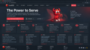
FreeBSD website redesign...

Thanks i just thought 2 most important things would be 1.Download button 2.Handbook button right next to it..cause it is widely used and it is only recommended way to manage through FreeBSD. Rest of the page should be minimal easy to read, with good color selection..i messed up that red text..the more i look into it it becomes more obvious :D
Good thinking.
Neon red can feel more expensive but the the current one is fine - it is not eye sore.
But my sight is deformed by years of navigating obsolete SCADA systems, so don't listen to me re colors.

I am sucker for Google Play font, tho.
 
No problem, well it can be red but not as bright, dark background requires lighter color..this is also one example of traditional/modern look for FreeBSD Homepage..with lighter red text..it looks more readable.
 

Attachments

  • FreeBSD Power to Serve Homepage.png
    FreeBSD Power to Serve Homepage.png
    1.8 MB · Views: 20
Back
Top