Only if you are using file managers like Thunar/PcManFM, etc or systray apps. As for themes, there aren't actually "themes" for i3, only schemes colors which can be manipulated from config. Some people prefer a solarized aspect other dark, etc.As for icons - are they necessary for i3 ? I looked into Suru++ theme and most if it is app icons.
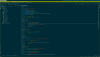
 I have almost vanilla i3 + i3status + vim with solarized dark at the moment.
In the right container it's opened sysutils/py-ranger (with ranger_devicons). I don't use GUI apps so much, although I have x11-fm/pcmanfm installed. Yes, for workspaces I've used x11-fonts/font-awesome and the status it's x11/i3blocks. As for the invested time I did this over time, since I'm using i3 from 2013.I'm thrilled how much time you've invested to make this eye candy
Is it PcManFM on the right ? Is it QT or GTK version ?
Workspace icons are from x11-fonts/font-awesome ?
What theme do you use to get uniformed look
sh shell with default coloring for readability.")