KDE Plasma 5.24

Via <https://www.theregister.com/2022/02/09/plasma_524/>: Plasma 5.24 - KDE Community

An example of the overview feature:

2022-02-12 07-48-48 KDE Plasma, Overview.png


To other users of 5.24: after you enable the overview feature, then apply your change, does the effect appear in response to the default shortcut?

Meta+W
 
Useless! They should fix the horrible UX of their dialogs instead of adding features that make the GUI even more complex and less understandable.
 
Easily. One example - File Save dialog:
- Left hand side: places (Home Folder, Desktop, my mounts, ....) - I cannot remove useless entries like Desktop that I never use. I like the Favorites concept but I need to remove junk that is definitely useless to me.
- Path is presented as horrible buttons instead of a simple text field with the actual path so that I can see where exactly does the file land? I cannot differentiate /tmp from ~/tmp because both are presented as "tmp", which leads to often saving the file to the wrong place. Keep it simple, stupid! Just put a simple text field there.
- Where is the "one directory up" button? Going to the parent directory is a chore of clicking a few times to find out where the hell I will be going.
- The default theme is mono - I hate that. They should make a normal colorful theme default. Our monitors support more than 2 colors already, can you believe that?
- Good that I have a button for creating a new directory! However, putting a little text on the button would be nice! It would not be THIS bad if they had a little bit of color on the button, but in monochrome mode I have to wonder for about 10 seconds if pushing this would do what I expect it to do.
- The dialog is not completely navigable by keyboard only. Requiring a mouse is a big no-no.

I completely understand that tweaking much of this is possible. Yes, you do have the source, you could patch it yourself. But why should the sensible behavior require for such hacks? It should be the default and the slicky-clicky unusable eye-candy should be done by tweaks.

Sorry for the rant, I still miss the simple and straight forward dialogs of Windows XP (even Windows 7 is not that bad). I think the modern UI developers changed so much, they overshot the target. They missed the sweet spot.
 
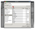
Save File dialogue


Location, path


Control-L

View attachment 12961


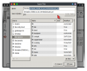
Folder navigation


To the left:

View attachment 12962


Folder creation


Text on a button:

View attachment 12963
- I know there are hacks for most of this, but the defaults are really bad.
- Ctrl-L does not work in the file save dialog.
- Folder navigation: Yes, by doing a couple of clicks one COULD go to the parent folder. There is no dedicated button for this. In my environment I have to first click on a small left-pointing triangle first and uncover the full path, then I have to find the button somewhere on the right and then click it. Inefficiency is the way of the 21-st century apparently.
- Text: My button does not have a text.
 
The Tab key automatically expands the location (path), in the simple text field that you wanted, the field that does exist.

Type:

/me

1644689886114.png

– then key Tab:

1644689990441.png

The places bar cannot be reached by pressing Tab.

If you mean that Tab does not move from the location field to Places, that's because Tab has a more useful purpose (above).

For Places, there's the visible underline as a hint. Use:

Alt-P

Depending on the context, it may be necessary to use the shortcut twice.

… Ctrl-L does not work in the file save dialog. …

It does for me.

… In my environment I have to first …

… My button does not have a text. …

Can you share screenshots of your environment?

I have used Plasma for so long, it's difficult for me to imagine what's missing for you.
 
  • Like
Reactions: drr
Easily. One example - File Save dialog:
Interesting. I am a long-time KDE-Plasma user and I have not come across these issues. I am able to hide/remove places, access path in text mode, access directory up button, etc. without any hacks.
 
Interesting. I am a long-time KDE-Plasma user and I have not come across these issues. I am able to hide/remove places, access path in text mode, access directory up button, etc. without any hacks.
Same here, 100% agree! That said haven't seen 5.24 yet.
 
… The overview feature works as expected with the default shortcut Meta+W.

Thanks. I discovered that my problem is not specific to 5.24; the bug is reported, I'll seek help elsewhere.

𡀦… I am able to hide/remove places, …

The Places sidebar of Dolphin allows Desktop to be hidden.

The Places sidebar of the Save File dialogue of Kate does not allow Desktop to be removed (or hidden):

1644763487273.png

I didn't look beyond those two apps. The presence of Desktop does not bother me, because I do use the feature.
 
The Places sidebar of the Save File dialogue of Kate does not allow Desktop to be removed (or hidden):

grahamperrin, is the file dialog in your screenshot the GTK one? I get a similar file dialog with GTK applications, like Firefox, in KDE. Please see the screenshot below of 'save as' dialog of my Firefox. As you pointed out, it is not possible to remove the 'Desktop' shortcut here.

Screenshot_20220213_215719.png


However, I get a very different KDE file dialog for KDE applications. Please see the screenshot of 'save' dialog of my Kate. It allows the shortcuts, including 'Desktop', to be hidden or removed.

Screenshot_20220213_215151.png


I suspect that D-FENS's comments may be about a non-KDE file dialog. I have tried in the past to make Firefox use native KDE file dialog with deskutils/plasma5-xdg-desktop-portal-kde but did not succeed.
 
I guess you get the same richness in the Save As… dialogue for Spectactle. True?
Yes, I get this native file dialog on all my KDE applications.

I have noticed that I get four different file dialogs on my computer, as shown in the screenshot below: (1) Top left - native KDE applications. (2) Top right - GTK applications like Firefox. (3) Bottom left - non-KDE Qt applications like QGIS and Virtualbox; similar to native dialog but sans the network option. (4) Bottom right - Libreoffice binary package; I believe it is compiled with Qt.

Screenshot_20220213_230420.png
 
D-FENS and all: my apologies for the misleading parts of conversation above.


Since I ceased using this environment variable:

QT_QPA_PLATFORMTHEME=gtk2
  • I do realise some accessibility bugs with KDE's dialogue(s) – not specific to Plasma 5.24
  • my three bug reports below are mostly invalid.
FreeBSD bug 257244 – x11-wm/plasma5-kwin window title bars no longer respect my preference for a mono-spaced font

KDE bug 447675 – Clicking, or pointing at, the icon of a file causes the name of the file to disappear (until the pointer is moved away from where it's required)

KDE bug 450071 – Meta (Windows) key shortcuts not working as expected
 
  • Thanks
Reactions: drr
Usability-wise nothing seems to have changed, which is a good thing.
I have noticed one change since the update to 5.24. I remember 5.23 placing windows for minimal overlap and/or remembering window positions by default; I have not looked into these settings in 5.23, but that was the behavior I experienced.

After update to 5.24, window placement was centered by default. Though remembering window positions was enabled by default, it did not seem to apply.

I could revert this behavior easily by changing the setting under window management > window behavior > advanced.
 
… 5.24, window placement was centered by default. Though remembering window positions was enabled by default, it did not seem to apply. …

Keyword:
  • if
1644910498570.png


Kate remembers its position.

FeatherPad does not. You can drag its window off-centre, quit, reopen the application, drag its window off-centre, open a new tab, detach the second tab:
  • the new window (of the detached tab) is centred.
 
  • Thanks
Reactions: drr
Keyword:
  • if
Thanks. I observed the change in window placement with Firefox. It could be a result of 'centered' versus 'minimal overlapping'; I keep the Firefox window tiled to one horizontal half of the screen.

5.23 used to place new Firefox windows tiled like this, in its default configuration. After upgrading to 5.24, I cleared old configuration files to make KDE create the new default configuration. That's when I noticed the difference.
 
Can you share screenshots of your environment?

I have used Plasma for so long, it's difficult for me to imagine what's missing for you.

Sure, here is a screenshot:
1645296386800.png


The button for creating directories is textless.

I tried Ctrl-P, it works indeed. I take my words back. I know, I know. KDE is extremely flexible, open source, yadda yadda yadda. I agree. But it needs a great deal of tweaking and hacking and I need to concentrate on other things.
Maybe I'll make a list of all things that bother me and then take a week as a sabbatical and tweak the s...t out of my GUI. And hopefully make a blog post out of it.
I'll name it "Making KDE usable". And while I'm at it, I'll make another one: "Making Firefox secure", because it needs about a 1000 tweaks to stop leaking personally identifiable stuff.
 
True, but the icon is non-ambiguous (a folder with a plus), and there's text when pointing:
I am not arguing it is ambiguous. I just need about 15 seconds to locate it every bloody single time I use the dialog.
A good icon is one that helps you locate and use the button in <1 second.
A good icon *does* have colors, it is easy to understand and does not require staring at it to get the meaning.
The icon under discussion is a bad one. The plus is way to small to even recognize on a big screen, the icon is monochrome. They could just change the plus to be bigger, fatter and red, blue or green - this would increase the usability by 500%.

The funny thing is, I like KDE a lot. I think it's an excellent product, except for some of their dialogs and the Dolphin file manager. Luckily, the latter could be easily replaced by a better one - I use Midnight Commander.
 
Back
Top