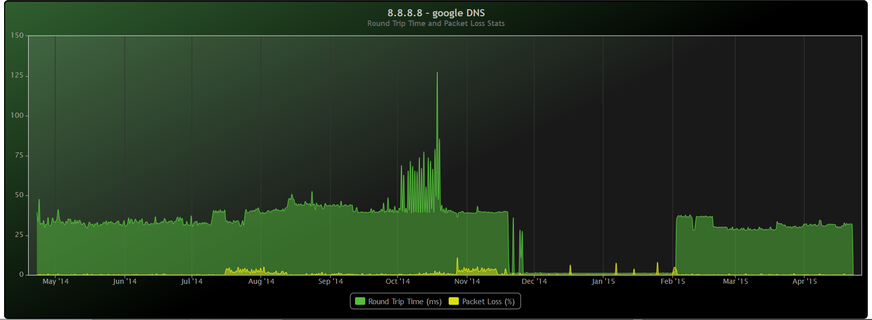
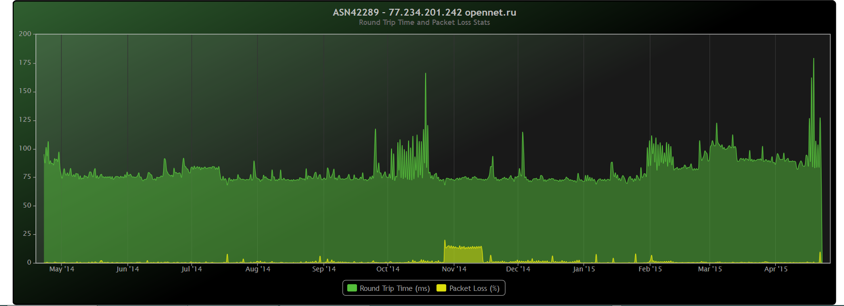
Hello,
phoenix, highcharts is just a javascript API which you can use for graphing your charts. I don't like to use ready software for graphs like Collectd, Cacti, Symon or others, so yes it is a custom software for collecting and storing the data. Of course I have almost all of them installed, and all of them are non-understandable for me. I'm attaching below one Munin graph from one Linux (

, unfortunately Linux because of no drivers for FreeBSD for my hardware) server that I have. Because the graph is very big, it is very hard to read it for me. You can read only legend, which for me personally is unusable. On highcharts reading such 'big' graph is very easily, because their API has an option to exclude dynamically some of the charted parameters, which will help you to read you graph easily.

Graphing charts is currently done by highcharts. I'm using RRD to store the collected data, my application reads the data from rrd databases, converts it in JSON format, which is used by highcharts API to graph the chart. You have only to get your data, nevermind if you are using rrd databases or MRTG or something other for storing your data, and push it to the highcharts.
Depending how your design is organized, JavaScript coding is not more than 40-50 (tabluted) rows. My design for example is to see the desired graphs you have 2 option menu. First one is to choose the desired server, second one is to choose desired type of graph (load, memory, CPU or all). If you choose to see for server X all graphs my html shows all yearly graphs for the selected server. If you choose to see only load graph, my html shows daily, weekly, monthly and yearly graph for the selected server. Since my JavaScript knowledge is pretty basic (to be understanded as almost none

), a friend of mine helped me with those 40-50 javascript code on the frontend.
Backend design is also simple. My collected data is stored in RRD. I keep those rrd on the hard drive. Directory structure is as follows, for every monitored server I have directory on the hard drive. For server Y I may collect only 5 types of graphs (load, memory, CPU, HDD free space and frontend connections), for server Z I may collect 20 types of graphs. All these types of graphs are different subdirectories for the desired server.
Example hard drive directory organisation:
Code:
/home/rrd/ (Level 1: physical directory where I create all monitored server with subdirectories for desired type of graph)

  /home/rrd/server1/ (Level 2: physical main directory for server 1)
     /home/rrd/server1/load/ (Level 3: physical main directory for server 1 - type of graph load avegrage)
         /home/rrd/server1/load/load.rrd (Level 4: rrd database file with collected data for load average for server 1)
     /home/rrd/server1/memory/ (Level 3: physical main directory for server 1 - type of graph memory)
         /home/rrd/server1/memory/memory.rrd (Level 4: rrd database file with collected data for memory for server 1)
...
  /home/rrd/server2/ (Level 2)
     /home/rrd/server2/disk_latency/ (Level 3)
         /home/rrd/server2/disk_latency/disk_latency.rrd (Level 4)
...
   /home/rrd/server3/ (Level 2)
      /home/rrd/server3/backend_connections/ (Level 3)
          /home/rrd/server3/backend_connections/backend_connections.rrd (Level 4)
      /home/rrd/server3/frontend_connections/ (Level 3)
          /home/rrd/server3/frontend_connections/frontend_connections.rrd (Level 4)
...
My application reads the data from all these .rrd files and converts it in JSON format for the frontend.
Here is example JSON structure for multiple servers with multiple type of graphs:
Code:
object:
type: array
  server_name:
  - type: string
  - value: the short name of the physical directory from the hard drive for the server, for example server1; points to the short name of Level 2 directory structure from the example
      name:
      - type: string
      - value: custom name of the graph which will be visualized in the web, for example BlaBla Server
      plugins:
      - type: array
        plugin_name:
        - type: string
        - value: the short name of the physical directory from the hard drive for the server with desired type of graph, for example load; points to the short name of the Level 3 directory structure from the example
           name:
           - type: string
           - value: custom name of the plugin which will be visualized, for example Load Average
           rrdfile:
           - type: string
           - value: name of the rrd file, for example load.rrd; points to the short name of Level 4 from the example
Example returned values:
Code:
{
   "server1": {
     "name": "BlaBla server",
     "plugins": {
       "backend-conn": {
         "name": "Backend Connections",
         "rrdfile": "backend-conn.rrd"
       },
       "bce0": {
         "name": "External Interface some_ip_address",
         "rrdfile": "bce0.rrd"
       },
       "cpu": {
         "name": "CPU Usage",
         "rrdfile": "cpu.rrd"
       },
       "diskio": {
         "name": "DISK I\/0",
         "rrdfile": "diskio.rrd"
       },
       "load": {
         "name": "Load Average",
         "rrdfile": "load.rrd"
       },
       "mem": {
         "name": "Memory",
         "rrdfile": "mem.rrd"
       },
       "frontend-conn": {
         "name": "Frontend Connections",
         "rrdfile": "frontend-conn.rrd"
       }
     }
   },

   "server2": {
     "name": "BlaBla Server 2",
     "plugins": {
       "bge1": {
         "name": "Internal Interface some_ip_address",
         "rrdfile": "bge1.rrd"
       },
       "cpu": {
         "name": "CPU Usage",
         "rrdfile": "cpu.rrd"
       },
       "diskio": {
         "name": "DISK I\/0",
         "rrdfile": "diskio.rrd"
       },
       "load": {
         "name": "Load Average",
         "rrdfile": "load.rrd"
       },
       "mem": {
         "name": "Memory",
         "rrdfile": "mem.rrd"
       },
       "backend-conn": {
         "name": "Backend Connections",
         "rrdfile": "backend-conn.rrd"
       },
       "couchdb_codes": {
         "name": "CouchDB HTTPD Status Codes",
         "rrdfile": "couchdb_codes.rrd"
       },
       "couchdb_couchdb": {
         "name": "CouchDB Reads & Writes Requests",
         "rrdfile": "couchdb_couchdb.rrd"
       },
       "couchdb_httpd": {
         "name": "CouchDB HTTPD",
         "rrdfile": "couchdb_httpd.rrd"
       },
       "couchdb_methods": {
         "name": "CouchDB HTTPD Requests Methods",
         "rrdfile": "couchdb_methods.rrd"
       }
     }
   }
}
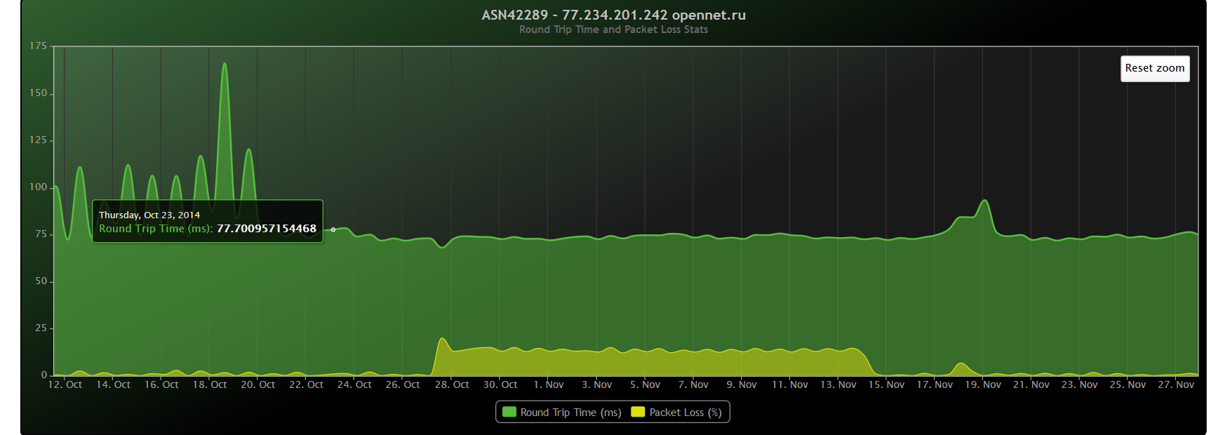
protocelt, nothing wrong with the old graphs. Just the new one are modern with zooming option, you can place any custom notes on selected period. Like for example my packet loss in November, when you click on that period you can place a note like "network cable changed". Also if you have multiple options in your graph, you can exclude some of them, which will help you to 'read' your stats more easily. Let say in the new attached graph in which I measure my disk latency, I would like to know exactly what is the average time, so I exclude any other options and see only the desired metric.
Multiple values, hard to see average values:
All others excluded except average values:


