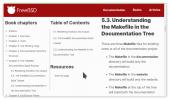
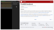
FreeBSD Handbook Gets a New Layout

Try:
https://docs.freebsd.org/en/books/handbook/eresources/#eresources-mail[Mailing Lists]

If you remove the text
Mailing Lists
the complete URL will be displayed. The square brackets(*) (even with zero characters between them) ensure that the URL is always parsed as a URL, e.g. when surrounding the whole caboodle with double quotes it will still be recognized as a URL (and displayed as such):
"https://docs.freebsd.org/en/books/handbook/eresources/#eresources-mail[Mailing Lists]"

Inside the square brackets any closing-square-bracket must be escaped by a preceding backslash character.

At AsciiDoc Home Page, using the TOC entry Cheatsheet, you'll find the examples at AsciiDoc cheatsheet - Macros: links, images & include perhaps also helpfull.

___
(*) you might be thrown off track by thinking these square brackets denote the "optional-thing"; here they do not: they are to be treated as literals, i.e. just the characters opening-square-bracket ( [ ) and closing-square-bracket ( ] ).
 
Thanks Erichans, the cheat sheet is an ideal starting point.

PR drafted, through which I should gain clarity on stuff that's in neither the primary cheat sheet, nor the nearby AsciiDoc cheatsheet for GitHub.
 
I'd like them to put << Prev/Next >> links at the top and bottom of the page and not just at the bottom.
Yes, you're not the first who request this thing to me. I'm gonna make this change too

Not sure if this was already mentioned/reported but one thing I noticed is that specific type of "code section with steps" uses an unfortunate font color in dark mode.

Example: https://docs.freebsd.org/en/books/handbook/cutting-edge/#makeworld

Screenshot:
View attachment 12423
Fixed, sorry for the inconvenience. I also improved more things in dark and high contrast themes.

Sorry, I'm overwhelmed by the AsciiDoc User Guide, and given examples are confusing more than helping me.

How should I fix this:

the extref:{handbook}[list in the Handbook, eresources-mail] and

– to refer to the URL below?

<https://docs.freebsd.org/en/books/handbook/eresources/#eresources-mail>

I need to improve the extref macro, right now it's not easy to use and to understand, sorry :(

But in first place, we're not using the old python implementation of AsciiDoc, this implementation was discontinued a couple of years ago. We're using AsciiDoctor, and the Asciidoctor documentation it's here.

And to fix the problem you reported it would be:

the extref:{handbook}ereources[list in the Handbook, eresources-mail]

Try it first, maybe I forgot something, but it's something like this. Again, sorry for this macro, I need to improve it and pass the chapter as a param :'‑(
 
<< Prev/Next >> links at the top and bottom

Related: FreeBSD bug 260821 – Aim to make icons (book, edit, important, next, note, previous, tip, top, warning …) more broadly compatible across multiple operating systems and browsers

… A potentially challenging bug, …

– sorry!

Let's not rush this. …

carlavilla that's a sincere apology. I suggest taking a well-deserved break :) and shelving 260821 until the new year.

For what it's worth, I foresee only three more p2-like bugs arising, from the new design, over the next few days, then it'll be p3 and below.

Big thanks for your recent work. Stupendous.

all font awesome intended glyphs don't render properly (use inter font)

Is that, 260821? :)
 
👍 and/or Navigate Up:

1640918794475.png
 
Columns, and single-page alternatives

The wish for a column-free and/or single-page alternative is (for me) far more frequent than readiness to edit:

1640947486716.png

carlavilla maybe the Resources subsection can, eventually, expand to something like this:
(That's an en-specific link.)

You could, equally/alternatively, have install documentation in the footer, however if it's (often) hidden down there, then readers will be far less likely to realise the benefits.

Generally

Each link should be Control-click -friendly, to simplify opening in a new tab. Command-click -friendly, on Macs. (Compare: UX problems with the BSD Hardware Database.) IIRC some collapsible items lacked this quality a few days ago, today 👍 at a glance it's much better. Thanks!


I don't enjoy saying/writing this … the three-column approach doesn't appeal to me. Sorry. There's often duplication, sometimes also wastes of (white) space.
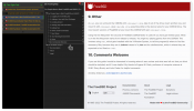
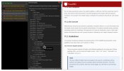
A much more enjoyable afterthought, as 2022 approaches:

 
Can we try setting the text colour in the left column/Chapters to black instead of 68% mid-grey please? The text is a bit small and increased contrast might make it more readable. Many of us are greybeards these days. I realise that many web designers seem to be enamoured with the current fad of mid-grey text on pale grey backgrounds, but just because everyone else is doing it doesn't mean it's the right thing to do :) Thankfully, you didn't go all Microsoft and choose pale grey on light grey and "hidden" hyperlinks :)

Oh yes, and I second the motion to get rid of the right side column. It just seems to be an expansion of section content list already in the left column. It looks redundant.
 
[...] I don't enjoy saying/writing this … the three-column approach doesn't appeal to me. Sorry. There's often duplication, sometimes also wastes of (white) space.
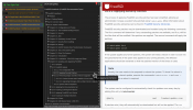
The two TOCs take up a lot of real estate and are not always needed. Even with a wide screen this more or less forces the user to set the browser to full width while for example a half width wide screen with only the handbook text is quite agreeable and readable.

Besides this scenario for a wide screen, there are also a lot of "narrow" screens around. Quite a lot of (FreeBSD) laptops do not have a wide screen and in a desktop two monitor setting a secondary monitor may not be wide screen.

Apart from the possibility of a HTML-handbook-text-only (no side TOCs) as in the old style handbook, there is another option that could be used for the current set up:

HandbookCollapsible.png

Clicking on a triangle in the grey side bar will expand that side TOC to its original form. Some form of triangle in the opposite direction will remain at the border of the side TOC and the main text: clicking on that one will minimize the side TOC again as shown in the picture. This somewhat resembles a similar action in Adobe Acrobat Reader where two side area's can be manipulated. There the width of side areas are controlled gradually by sliders. I don't think such a slider is necessary here. A switch-on switch-off is much easier to implement: basically the two elements (TOC & hidden TOC with vertical bar) could both be present in the loaded html page, both are alternatively switched on or off.
 
Thanks.

One collapsible sidebar: OK

Two sidebars, with or without collapse: less usable.

Two sidebars at a distance from each other: far less usable, and the negative effect of distance is worse whenever the user aims to perform dual actions involving both sidebars. Actions such as scrolling, clicking, collapsing, whatever … IMHO it's simply not good UX.

(This is the reason for me having a user style that aims to keep the two sidebars adjacent to each other.)
 
I just noticed it tonight and it does look 100% better. 👓

I rarely ever looked at it for anything but there is an abundance of information contained now.
 
I personally think the old styling looked much nicer 😔

BUT: Usability is clearly improved, and that's more important of course 👍

BTW:
table of content in a separate frame
Glad they didn't use a HTML <frame> for that! Progressive enhancement starting at the most basic console browsers is really important here ;)
 
  • A complete TOC
    - enabling a quick search for a specific term or topic
    - enabling a detailed overview of the complete contents of the handbook
  • An index
Apart from (the 100% option of) just the text(*), in the newly styled online handbook, I really miss the complete TOC like "the old TOC". A complete TOC, in addition to a "small" one, is also somewhat similar of a (big and important) book that has two TOCs. One giving the reader just an overview: the big picture. The other giving a detailed picture guiding the reader in the detailed structure of the contents of the book. This aspect may be easily underestimated but, getting familiar with the structure of such a large and rich content of a book as the FreeBSD handbook is IMO an important aspect for new users and even for experienced users that may know their way around in quite a few parts of the handbook but not all parts.

When searching "the old TOC" you could search for a term in the context of its surrounding sub-titles (for example poudriere). The TOC on the left side cannot be easily expanded completely, for example with just one click. Not surprisingly, a search hit for a search term in a sub-title in teh left or right TOC, will only occur when the text is actually visible. The search of the complete TOC could be considered a pour man's search however, that is a search where you will find main (sub)topics in the context of its surrounding titles. This brings me to the index.

I also miss an index in the online handbook (like "the old index"). An index is the detailed and tailored mechanism to find the relevant text parts for a particular term. I emphasized relevant because that sets it apart from an ordinary string search over the complete HTML text of the handbook. Compiling an index is a non-trivial task!


I woul find something like this already really helpfull:

Detailed TOC.png

Note: yellow only for highlighting and right hand side TOC not done.
___
(*) I noticed at the newly styled online handbook page, when clicking Single HTML: the TOC on the right stays but, the left TOC disappears! 👍
(If I recall correctly, that was not the case earlier in the newly styled online handbook.)

Edit: screenshot image added; clarification added as to referring to the newly styled online handbook betweem "([...])"
 
Back
Top