Solved Forum text selection is far too pale in edit mode

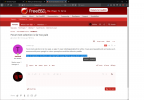
Forum text selection (in the edit box) is far too pale, so pale it's near indistinguishable from white. I have good eyesight and can barely see it, someone with poor eyesight or colour perception would be without a paddle.

How to reproduce: Use forum, select text with mouse then try guess what is selected.

edit: See below, this wasn't right.
 
How to reproduce: Use forum, select text with mouse then try guess what is selected.
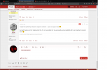
It's blue here, quite distinguishable.
 

Attachments

  • selected.png
    selected.png
    145.6 KB · Views: 132
Sorry, I missed a step... How to reproduce: Create or edit post, in the edit box select some text.

In this image "select some text" is selected, I've underlined it:

Screenshot_2020-12-29_09-23-08.png
 
I agree with the OP. Since some times, it's a pain to write here. And the whole design of posting and formatting text is bad, but everyone has seen that.
 
I agree with the OP. Since some times, it's a pain to write here. And the whole design of posting and formatting text is bad, but everyone has seen that.
I'm just talking about the pale text selection (in edit mode) and trying to give constructive feedback. It didn't help I gave wrong "reproduce" instructions in first post, and I'm new here so my posts lag (waiting approval).
 
The original editor is currently a little "broken". We normally have an addon for the editor running. An update to the forum software however broke the addon so we had to revert to the 'standard' editor that comes with the forum. As far as I know the addon hasn't been updated to work with the new version of the forum yet.

The addon also took care of some of the custom BBCodes we had. That's why things like @<username> are now messed up too.

Edit: I checked up on the addon. Looks to be in a beta phase right now (with an express warning not to use it on production sites yet). Hopefully it will be released soon so we can fix this. You're not the only one that's annoyed by the bad formatting, I have to edit a LOT of posts just to make them more presentable.
 
Yes, the problem still exists, in edit mode. In this example I have selected the word 'git'. Can you see it?
FreeBSD_forums_Screenshot_2021-01-02_14-18-38.png
 
I was revisiting my old forum post. Marked as solved, could have been months or weeks ago... doesn't matter, seems fine now.

edit: The original issue which was fixed:
Forum text selection (in the edit box) is far too pale, so pale it's near indistinguishable from white.

Below is further discussion regarding fine tuning colours, for some reason revitalised with this post nearly 6 months after I started the thread. It is a different, yet related, topic - I suppose continued discussion in this thread won't hurt anyone.
 
Last edited:
I'm not sure if it's my new monitor or not--I suspect that it is, as other sites with hard to read text are now easier to read, but now, highlit text has become pretty easy for me to read. Again, it coincided with the new monitor.
 
I wouldn't have marked this as solved.

Sure, the quality of your monitor is relevant. But it shouldn't be. Contrast should always be strong for selected text. This is also important to be accessible for the visually impaired.

Post editing has two different modes: a "source" mode and a (kind of WYSIWYG) BB-Code mode. All is fine in the source mode, selected text is clearly distiguishable. Not so much in BB-Code mode, you just get some pale pink background that's really hard to distinguish from the default background, and the text color doesn't change at all.
 
Not so much in BB-Code mode, you just get some pale pink background that's really hard to distinguish from the default background, and the text color doesn't change at all.
I think I actually found where that setting was hiding. I believe this was done to improve the selection with the dark style we have. But it looks like this was modified in the "parent" (which includes the "normal" FreeBSD style), it then gets inherited by the "dark" style. I'll see if reverting the parent to the default and setting it specifically in the "dark" style helps.
 
Hmm. The default appears to be even lighter than what it was.
 
Hmm. The default appears to be even lighter than what it was.
Uh, not good :D So, can you do anything about that? Like explicitly define the colors for every style supported? I really think this is a valid complaint, if you either have a bad monitor or you're visually impaired, this is a usability problem…
 
Yeah, you can change the RGB value, that's what the change originally was. The default is a named color setting, which is even lighter. I don't want to muck around with those settings too much. I see the "dark" mode is even worse. There it has that "light pink" background color but the text is white, making it totally unreadable.
 
Time to open a ticket with the vendor? 😈

Sorry, I don't want to nag ;) "web design" is really a PITA sometimes…
 
Not much support to get for, it's just a setting in a template that defines the color. The trick is to find the right setting, there are literally dozens of color settings for everything.
 
Additional thought: Maybe the issue is that the text color doesn't change. If the "normal" display is "dark on bright", the selection should reverse it (and vice versa).

If you keep the text color the same, you will run into problems ;)

(in a stupid old terminal app, selection will be simple "reverse mode" – which works quite fine. In a web app, you will deviate from that for CI reasons, but typically still keep the dark/bright relationship)
 
If you keep the text color the same, you will run into problems
Yeah, that seems to be the problem with the "dark" mode style. The colors don't "reverse", in other words the selected text stays the same color as non-selected text. Simplest way when you select text is to "reverse" the foreground and background colors.
 
There is a "Highlighted content background color" that defines the background color of the selected text. I'm looking for a similar setting but for the text color and I can't seem to find it. They all have lots of seeming unrelated names. I'm basically looking for the "Highlighted content text color".
 
I might be spoiled by enterprise support contracts → open a support case :D

But well, thanks a lot for looking into this. It's not a problem for me personally, but accessibility still is an important concern I think :)
 
It was originally a lot lighter, as shown in the previous screenshots, that was barely visible at all. If I recall correctly danger@ already changed it a bit a while back.
It now looks like this: selected.png

Could probably still need a little more "definition" but this also seems to directly affect the "dark" style, that's now barely readable.
 
Could probably still need a little more "definition" but this also seems to directly affect the "dark" style, that's now barely readable.
I guess to finally solve this, you need different colors for both supported styles. Hopefully this is possible. Still thanks so far for your efforts :)

(and even further thoughts: "reverse" isn't strictly necessary if contrast between bg and fg of selected text is strong enough and if contrast between normal and selected bg is strong enough. That's perfectly possible, but must be defined separately for a "light" and "dark" theme…)
 
Not much support to get for, it's just a setting in a template that defines the color. The trick is to find the right setting, there are literally dozens of color settings for everything.
It's not a trick, it’s Epiphany:
screenshot.png

However, before you suggest/change the colours of .fr-wrapper::selection, please colour-calibrate your monitor.
 
This is also important to be accessible for the visually impaired.
Yes, stated in the beginning.
I'm not sure if it's my new monitor or not--I suspect that it is, as other sites with hard to read text are now easier to read, but now, highlit text has become pretty easy for me to read. Again, it coincided with the new monitor.
Compare it side by side to the original screenshots...

current state:
Normal edit mode - pink text select. The pink is perfectly visible.
BB code edit mode - blue text select.

It would be better if both were blue.
 
It's not a trick, it’s Epiphany:
Except that the names of the different style configurations appears to have little to no relation with the CSS markers. There are style templates, each template has colors with names like "Content background color", "Feature text color", "Attention-grabbing border color" and so on. I haven't figured out the relation between those names and the various parts of the site's page.

This little line from the manual is something I will need to be careful about:
All templates can be customized using the template editor, but you should be aware that careless edits can break important site functionality if you don't know what you're doing.
I don't know what I'm doing, so there's a high chance I'm going to screw something up. That's why I'm a little hesitant just to change random entries to figure out which color setting changes what part of the site.
 
Back
Top