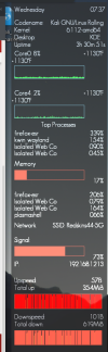
I'm trying to find a nicer graph to display on my conky. The current one is just a bunch of vertical lines and looks flat. (screenshot). is there a way to make it look better? I tried looking all over the internet, but can't seem to find the answer.
Here is part of the code:
Here is part of the code:
Code:
#network
${voffset 10}${goto 10}Network${alignr 10}SSID: ${wireless_essid wlan0}

${goto 10}Signal:
${goto 10}${color2}${wireless_link_bar 30,220 wlan0}${color1}${alignr 10}${wireless_link_qual_perc wlan0}%
${goto 10}IP: ${alignr 10}${addr wlan0}

${voffset 5}${goto 10}${color1}Upspeed:${alignr 10}${upspeed wlan0}
${goto 10}${voffset 0}Total up:${alignr 10}${totalup wlan0}
${goto 10}${color2}${upspeedgraph wlan0 45,275 5EE324 CAFEC 100 -t -l}
#${goto 10}${color3}${upspeedgraph wlan0 50,220 66241C FF5A45 100 -l}
${goto 10}${color1}Downspeed:$color1${alignr 10}${downspeed wlan0}
${goto 10}Total down:${alignr 10}${totaldown wlan0}
${goto 10}${color2}${downspeedgraph wlan0 45,275 5EE324 FF5A45 100 -t -l}
#
Attachments
Last edited by a moderator: