FreeBSD.org's "New to FreeBSD?" button hides production 10.3's link

Howdy :)

I hope that I am in the right place to report this issue.
I don't know if it just me, but it happens when I go to FreeBSD.org. It is not possible to see clearly the production 10.3's link neither is possible to click on it.
 
Yeah, if you resize your browser then the button / link has a tendency to overlap with others. I always browse full screen so it's no issue, but if I resize my window then it blocks 10.4 while 10.3 has wrapped onto the next line.
 
I tested the desktop and mobile versions of chrome and the issue only happens with the mobile one.
 
These "buttons" are floating text containers with rounded edges.
The problem is that to make these wrap correctly around text one has to give these "buttons" a defined width.
And I see no width definition in the CSS.

Many html designers define widths using pixel values. However, only percentage values scale correctly, but involve much more effort.
This is why I have a hate-love for float. It's nice and unavoidable, but to make it scale perfectly and not overlap with things, it requires quite a lot extra work.
 
the right place would be to post a PR to bugzilla and ideally a patch too :)
 
The CSS file is this: https://www.freebsd.org/layout/css/layout.css?20150916
Look the front*roundbox etc containers.
They are all based on pixel values. This has to be changed to ems or exs.
Furthermore, the section between top (title bar region) and bottom (the four grey rows) must be separated into cells defined by percentage widths.
Otherwise it won't work, neither with resizing, nor with enlarge (ctrl-+).
I'll make a PR later today.

Edit: PR link
 
Last edited:
These "buttons" are floating text containers with rounded edges.
The problem is that to make these wrap correctly around text one has to give these "buttons" a defined width.
And I see no width definition in the CSS.

Many html designers define widths using pixel values. However, only percentage values scale correctly, but involve much more effort.
This is why I have a hate-love for float. It's nice and unavoidable, but to make it scale perfectly and not overlap with things, it requires quite a lot extra work.

I have coded CSS buttons for my sites. It was my crowning achievement as far as CSS is concerned and can make buttons any size using pixels, em and percentage:

Code:
.button {
margin: 1em 0;
width: 11em;
font-family: tahoma,serif;
font-size: 80%;
font-weight: bold;
}
.button a {
display: block;
width: 100%;
}
.button a:link,
.button a:visited,
.button a:hover {
color: #000000;
background-color: #ffffff;
text-decoration: none;
}
.button a:link,
.button a:visited {
border-top: 2px solid #c0c0c0;
border-bottom: 2px solid #474745;
border-left: 2px solid #c0c0c0;
border-right: 2px solid #474745;
}
.button a:hover {
color: #800000;
background-color: #ffffff;
border-bottom: 2px solid #c0c0c0;
border-top: 2px solid #474745;
border-right: 2px solid #c0c0c0;
border-left: 2px solid #474745;
cursor: crosshair;
}

It's been a long time since I wrote this. I checked archive.org for my old site, uberkomplex.org, and it shows 4 captures but they don't appear for me, maybe my browser settings, or I could show you how they looked and work IRL. It has shading that switches on press. I'd have to dig to find my page code.

Edit: My bottom "hover" section fails to validate now for some reason, a fate worse than death, so I fixed it. It will break my dancing baloney shading but you can still use the valid button code below:

Code:
.button {
margin: 1em 0;
width: 11em;
font-family: tahoma,serif;
font-size: 80%;
font-weight: bold;
}
.button a {
display: block;
width: 100%;
}
.button a:link {
color: #000000;
background-color: #ffffff;
text-decoration: none;
border-top: 2px solid #c0c0c0;
border-bottom: 2px solid #474745;
border-left: 2px solid #c0c0c0;
border-right: 2px solid #474745;
}
.button a:visited {
color: #000000;
background-color: #ffffff;
text-decoration: none;
border-top: 2px solid #c0c0c0;
border-bottom: 2px solid #474745;
border-left: 2px solid #c0c0c0;
border-right: 2px solid #474745;
}
.button a:hover {
color: #000000;
background-color: #ffffff;
text-decoration: none;
}
 
Last edited by a moderator:
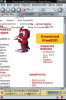
They say memory is the first thing to go... Here's my old uberkomplex.com bot site with working CSS buttons, which were at the time valid code by the WC3 tag.

Raising Bots To New Heights

The shading in the validated code above still works, too. Cutting "hover" broke the press action, but it doesn't change your cursor now. :p I checked it out.

Don't miss the "BotoErotica" bot/human transcript with my Personality Forge bot Siseneg, who is online 24/7 at the Forge.

Edit: I couldn't find the code to that page but here's how I stacked buttons of a wider width in another site version:

Code:
<td align="right" width="113">
<center>
<div class="button">
<a href="izezi2.html" title="HAL Child Machine" target="main">HAL</a>
<a href="alice2.html" title="ALICE" target="main">ALICE</a>
<a href="forge.html" title="The Personality Forge" target="main">The Forge</a>
<a href="explain.html" title="NLP vs CBR" target="main">NLP vs CBR</a>
<a href="voc.html" title="Visions of Chaos" target="main">VoC</a>
<a href="quat.html" title="Quat" target="main">Quat</a>
<a href="enter.html" title="Gallery Intro" target="main">Fractiles</a>
<a href="link02.html" title="Links" target="main">Links</a>
<a href="http://jigsaw.w3.org/css-validator/validator?uri=http://www.uberkomplex.com/return.css" title="W3C Valid CSS">Valid CSS</a>
<a href="http://validator.w3.org/check?uri=http://www.uberkomplex.com/" title="W3C Valid XHTML 1.1">Valid XHTML 1.1</a>
</div>
</center>
</td>

Edit: Here is how I implemented the buttons on the bot site. These are smaller, and by memory, the trick was to combine the valid CSS code above with the XHTML width factor to get a different width on a button:

Solar Storm Monitor

Code:
<br />
<h5>Space<br /> Weather</h5>
<div class="button">
<a href="Solar4.html" title="Solar Storm Monitor with real-time solar storm status from NASA and NOAA satellites" target="main">Storm Monitor</a>
<a href="storm1.html" title="The dynamics of the Sun, solar storms, and solar wind" target="main">Solar Storms</a>
<a href="tenothree.html" title="The largest solar flares ever recorded" target="main">Mega-Flare</a>
<a href="bulletins.html" title="Space weather bulletins issued by the Space Environment Center" target="main">Bulletins</a>
<a href="TRACE.html" title="The NASA Transition Region And Coronal Explorer" target="main">TRACE</a>
</div>
<br />
This code does not use tables, only div and the CSS.


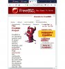
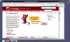
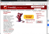
What you are calling CSS buttons on the FreeBSD site are completely different than mine, and had Snurg not referred to the fontcontainer as CSS buttons I never would have recognized them as such from looking at the site or code.
 
Here's what variable width CSS buttons look like and how they are implemented on my site:

trihexagonal.org

You should be able to fix things now. I just played around with it for a few minutes and worked it out.

That's the ticket:

Code:
<div style="float:left;width:33%" class="button"> <center> <a href="tutorial.html">FreeBSD Desktop Tutorial</a> </center> </div>
<div style="float:left;width:33%" class="button"> <center> <a href="customize.html">Wallpapers and Fluxbox Styles</a> </center> </div>
<div style="float:left;width:33%" class="button"> <center> <a href="customize3.html">IBM Thinkpad Wallpapers</a> </center> </div>

Feel free to resize the browser window to see how it flows.
 
Last edited by a moderator:
Once I got started writing again I saw what was keeping my original button code from validating and cleaned it up. Now the buttons work as intended with the press action as demonstrated on my site:

Code:
.button {
margin: 1em 0;
width: 11em;
font-family: tahoma,serif;
font-size: 80%;
font-weight: bold;
}
.button a {
display: block;
width: 100%;
}
.button a:link {
color: #000000;
background-color: #99b3ff;
text-decoration: none;
border-top: 2px solid #c0c0c0;
border-bottom: 2px solid #474745;
border-left: 2px solid #c0c0c0;
border-right: 2px solid #474745;
}
.button a:visited {
color: #000000;
background-color: #ffffff;
text-decoration: none;
border-top: 2px solid #c0c0c0;
border-bottom: 2px solid #474745;
border-left: 2px solid #c0c0c0;
border-right: 2px solid #474745;
}
.button a:hover {
color: #000000;
background-color: #ffffff;
text-decoration: none;
border-bottom: 2px solid #c0c0c0;
border-top: 2px solid #474745;
border-right: 2px solid #c0c0c0;
border-left: 2px solid #474745;
}
You can see how percentage is implemented now for variable width. For the Display element:

Block uses the full width available.
Inline uses as much width as it needs.

Use one value with the "border-radius" property for rounded corners:

Code:
border-radius: 10px;
Looking at it now, your own code should be alright. What you need to do is use the XHTML width factor with it for a variable width/height button that won't overlap the link in question when the screen size shrinks. With the correct width (should be 100%), something along these lines should be all it takes:

Code:
<div style="width:100%" class="frontnewcontent">
<a href="./projects/newbies.html">New to FreeBSD?</a>
</div>

Or feel free to use mine.

Edit: This is also listed as Bug 221209 from 2017-08-07.

Edit2: Edited to change width to 100%.
 
Last edited by a moderator:
That fixes it:

button3.png
button2.png
button.png

When you squeeze the window the button keeps its own space and pops down under the links when crowded. The button is the only thing on the page that doesn't overlap. I just used the code above to see if it actually worked, but you need to add "style and width" to everything so it all shrinks down in scale.

Edit: Ideally, you want it to scale like this:

scaling.png

That shows you the markup I use to do it on the index page of my site, how it scales down and the buttons adjust as needed in height and width doing so.
 
Hi,

When I visit "freebsd.org" I alwas see this "New to FreeBSD" link-button that catches my eyes.

IMHO it is misaligned and gives a bad appression when one arrives to the main page.

This is what I see when I land to the page with Firefox.


misaligned-in-main-page.png
 
It's because it's floating, make your browser window a little wider and it'll float to the "correct" position.

Things get even worse when you make the window even smaller.

(thread merged into existing thread on the same subject)
 

Attachments

  • FreeBSD.jpg
    FreeBSD.jpg
    107.9 KB · Views: 447
Thank you SirDice, I would have never thought that my normal Firefox witdh was not enough.

Anyway, I would change a bit the layout, I realize it is not really a big issue and also we are more or less all "techies", watching more substance than face of things, but first impression matters.
I can lend an hand on the fix if needed even if I admit I am not a pro in HTML UI design.

I post a view of my desktop (13.3-inch screen). With what I consider a normal browser window dimensioning. I guess I am not the only one to have a 13'' screen and not liking full screen stuff;)
 

Attachments

  • misaligned-in-main-page3.png
    misaligned-in-main-page3.png
    181.3 KB · Views: 437
Have a look at the PRs Snurg and Trihexagonal created, if you're up for it you can help out there.

Really, whoever has access to the source code of the freebsd.org index page could fix it themselves in editor/leafpad with18 keystrokes by just adding the XHTML width factor to the existing code to make it look like this:

Code:
<div style="width:100%" class="frontnewcontent">
<a href="./projects/newbies.html">New to FreeBSD?</a>
</div>
Instead of this:

Code:
<div class="frontnewcontent">
<a href="./projects/newbies.html">New to FreeBSD?</a>
</div>
The fontcontainer with "New to FreeBSD?" message is about halfway down the page and easy to see. That's where it goes.

That's all I did when it comes down to it. It was just seeing what was needed to fix it.
 
Save your existing index.html page first! Just in case. Rename it or save it on your machine.

This is the freebsd.org index.html page with my fix, renamed to index.txt so I could upload it:

If all goes well, and why you save your original if it doesn't, it should be enough to rename it index.html and just upload it to the same directory.

Gremlins aside, if you save it elsewhere and just have the new index page overwrite the old one, it should go off without notice. If not, just upload the old one to overwrite it and you're no worse off than before. It can all be done in 30 seconds, including to check if it's right.
 

Attachments

  • index.txt
    23.4 KB · Views: 214
I must not have had everything formatted correctly to begin with because it's not popping down under the links when crowded like it did when I tested it. That's no different than it looks now...

At a glance, the width factor needs to be applied to the Language Links and the div class elements between it and the New to FreeBSD button so they all maintain their own space, but I'm guessing at this point.
 
How about, When in doubt, kick it out... and make a dropdown menu of it. This is using index-2.html from Nicola Mingotti making a dropdown menu in place of the New To FreeBSD? button and applying the width factor to the Supported Releases and Shortcut links.

At first the shortcut links overlap with the Download FreeBSD button, but when squeezed down enough seperate as shown in the skinny.png. And the dropdown menu works with the word "newbies" aligned to the left like all the other words in dropdown menus
 

Attachments

  • index-2a.txt
    23.6 KB · Views: 198
  • normal.png
    normal.png
    256.4 KB · Views: 435
  • skinny.png
    skinny.png
    103.7 KB · Views: 473
I would keep the "new to Freebsd" large as it was, good for catching new people. A newbie feels he is cared ;)

I make abundant use of JQuery in my HTML. With that a lot of things bould be done, e.g. the right column could appear below the central column if the page width goes beyond a certain limit. But I red around a lot of people dislike the use of Javascript.
 
Back
Top