Solved understanding zabbix graph

Hi,

My some of my webiste went down due to database connection issue and I am not sure why.
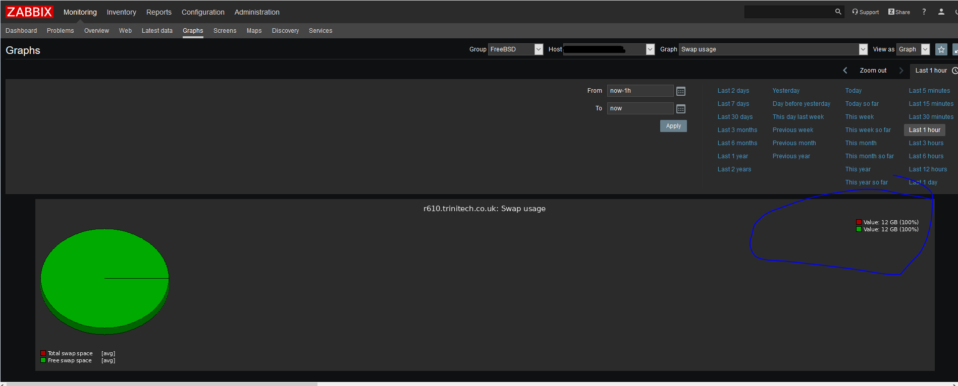
Looking at the zabbix, I cannot understand this graph
zabbix-swap.PNG

Could anyone please tell me what the bit I circled in blue mean?
Does it mean I ran out of memory?
I run 11.2-RELEASE on full zfs and 48GB of RAM
 
No; your Total (as in used + free) swap space is 12GB. Your Free swap space is also 12G. (Implicitly, your used is near 0.)
Zabbix uses both values here so it can display a pie chart where the total value is used to define 100%, and then the free value is plotted as a percentage of total.
 
I would suggest changing that default pie chart to a normal chart. It's impossible to see the usage over time this way.
 
I would suggest changing that default pie chart to a normal chart. It's impossible to see the usage over time this way.
I didn't know I could.. Sorry I'm on the steep learning curve with zabbix.
I actually use your zfs template SirDice . Could you please tell me how do I change it to normal chart?
 
You need to edit the standard FreeBSD template. "Template OS FreeBSD" -> "Graphs" -> "Swap usage". Set the "graph type" to "normal". You might need to edit the height and width too, so it's the same size as the other graphs.
 
Back
Top