So poudriere introduced a new web UI (hidden behind an innocent "upgrade web components" changelog entry) with version 4.2.1 3.4.1 - which is *definitely* not an improvement:
index on old UI looked like this:

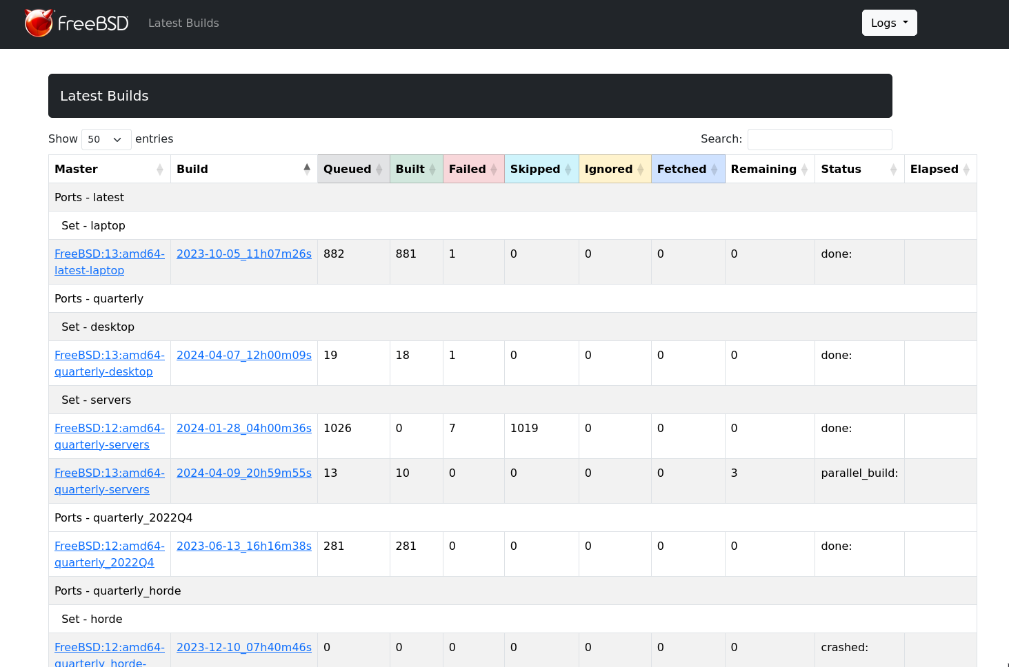
and with the new UI:

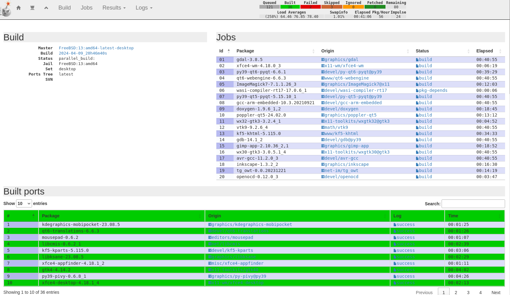
bulk results with old UI:

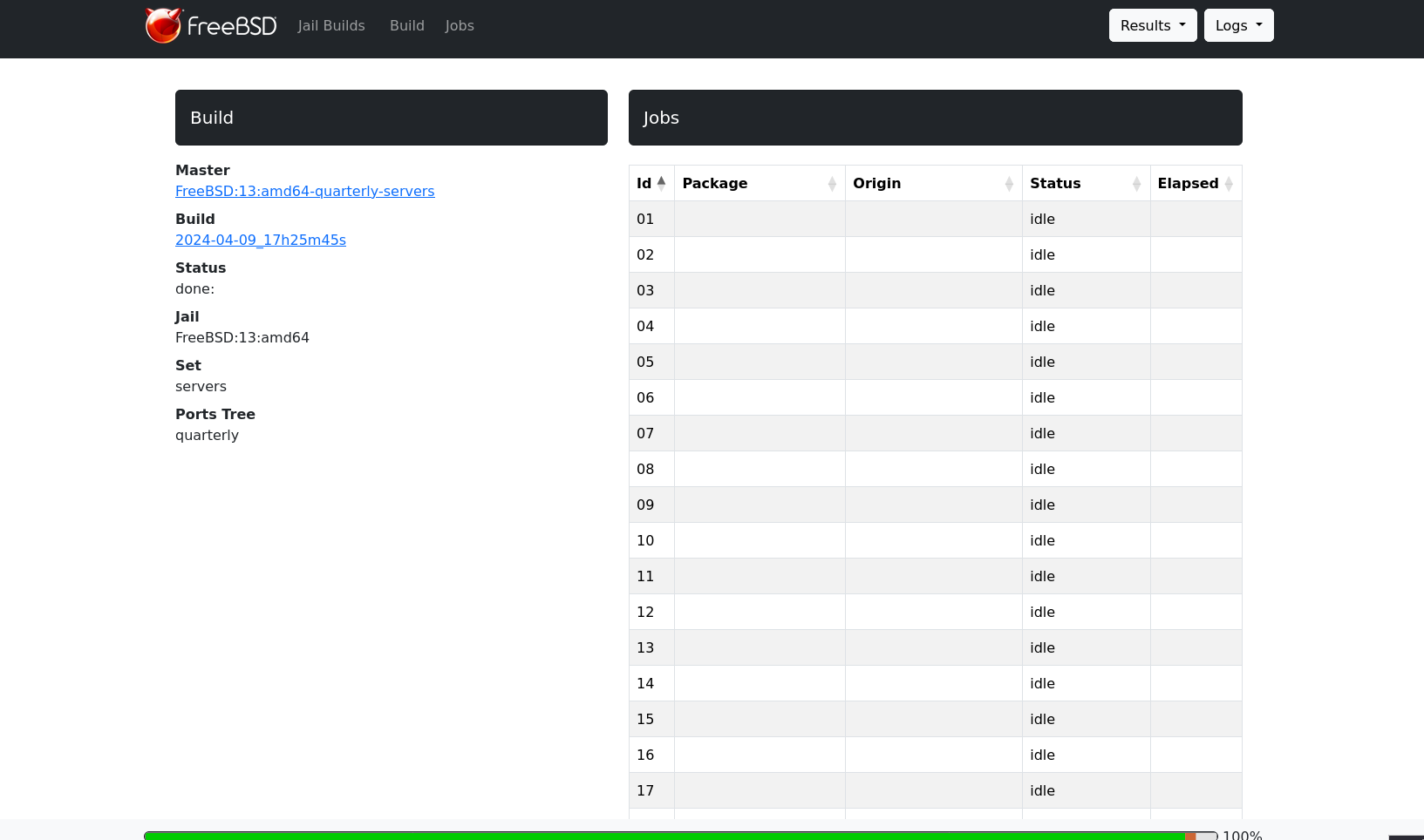
and on the new UI:

(yes, those are differnt build hosts)
Not only is the new UI much slower in comparison, but thanks to huge fonts and the table no longer using the full available width, there is now *at best* 50% of information visible on the same screen area.
Any chance this can be reverted or at least font size and table width dialed back to sane values (and not for blind people using a tiny smartphone screen)?
Sure, I could just zoom the pages, but this also further reduces the width used by the tables, so I'll end up with less than 50% of available window/screen width actually showing content...
For now I restored the /usr/local/share/poudriere/html directory from a snapshot directly into the webroot of the webserver jail, but this is more of a temporary solution.
index on old UI looked like this:
and with the new UI:
bulk results with old UI:
and on the new UI:
(yes, those are differnt build hosts)
Not only is the new UI much slower in comparison, but thanks to huge fonts and the table no longer using the full available width, there is now *at best* 50% of information visible on the same screen area.
Any chance this can be reverted or at least font size and table width dialed back to sane values (and not for blind people using a tiny smartphone screen)?
Sure, I could just zoom the pages, but this also further reduces the width used by the tables, so I'll end up with less than 50% of available window/screen width actually showing content...
For now I restored the /usr/local/share/poudriere/html directory from a snapshot directly into the webroot of the webserver jail, but this is more of a temporary solution.
