How to fix Firefox layout acting weird?

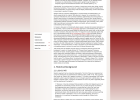
Please take a look at the screenshot - the text always appears centered way too much on firefox on freebsd. The same doesn't happen on Chrome on freebsd, or other browsers also.

Is there a fix for this? This simply makes the whole browsing experience pretty unreadable!
 

Attachments

  • Firefox font-layout issue.png
    Firefox font-layout issue.png
    142 KB · Views: 37
Do you mean the paragraph in the middle? That's a blockquote and should be the same in all browsers. Looks the same in Chromium and Firefox to me on FreeBSD
I mean the entire text is too centered on my machine. There's a lot of space on the left and right of the text. On Chrome it looks more comfortable and easy to read. Basically the layout is somehow messed up.

What can I possibly do to fix this? This seems to be default on my machine since a while
 

Attachments

  • firefox layout.png
    firefox layout.png
    448.5 KB · Views: 16
Is this an effect of missing FONTs ?
Usually installing the X11-Fonts/webfonts and configure them to your graphical desktop setup
allows some sites to use the fonts they were designed with such as ARIAL, Times Roman , Verdana or calibri , eg microsoft fonts.
 
Is this an effect of missing FONTs ?
Usually installing the X11-Fonts/webfonts and configure them to your graphical desktop setup
allows some sites to use the fonts they were designed with such as ARIAL, Times Roman , Verdana or calibri , eg microsoft fonts.
How do I do that? Wouldn't it affect Chrome as well if it was missing the fonts?
 
Tracker You keep showing the Firefox layout but not the Chrome one. Again, they look the same on my Firefox and Chromium and it appears to me to be by design.

Here's the site he's talking about.
Yea it turns out it won't let me upload a png because of file size issues - even tried compressing it. Anyways, the empty size on the sides isn't obvious? It just squishes the text way too much into the middle and is hard to read with such a small size/layout.

PS: Please don't ask suggest to magnify it because that's not what default behavior/repetative tasks are for.
 
It looks fine to me; the way it's laid-out make it look like a sub-paragraph that should be centered more than the other text.

Windows Firefox:

2.PNG


Windows MS Edge:

3.PNG
 
Back
Top