Hi again,
I have tested the new
CFF engine of Adobe (only a small part of it, there seems to be much more to explore), and I must say that the result of the quick test I did is quite beautiful (see the example below). What did I do? It was quite simple: First in needed a 'CFF font'. For this I used the open type version of Source Code Pro (regular) from Adobe, the one with the
.otf ending instead of the
.ttf ending. The
CFF engine is turned on by default in
freetype, and it works only with
CFF fonts if I understand this right. To test if it is really used when one uses the font mentioned before, just use the small program
ftview in the
freetype demos, which, when I remember this right, has to be installed additionally. Using
ftview, you can do all sorts of tests on your font when you tweak the font settings, use different standard filters or even create one. Especially with my font, one reads something like 'Engine: Adobe' somewhere.
At first different filters that I used on my font didn't effect anything, and after some searching I found out why that is:
By default the option 'LCD_FILTERING' is not activated when freetype is installed f.e. as binary. I had to reinstall
freetype and to activate that option.
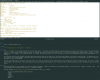
This was everything I did. I use a more or less standard
Xft setting (see my
.Xresources below) and used my font above (with 11pt) and got this result (with rxvt-unicode and the 'Seafoam Pastel' color theme):
https://forums.freebsd.org/download/file.php?mode=view&id=2127&sid=2fc728fd58e67c00026044fbaa57e7b2
The result is not bad and even beautiful in my opinion, I had not much to do for it. What can be done further is f.e. to change the default LCD filter I use here to make fonts looking more sharply as they already look. For this one could go into the source code of
freetype and change the default values for the default LCD filter. On my monitor, however, things look really good.
Her is my
.Xresources file:
Code:
#include "/home/rhodan/Rep/iTerm2-Color-Schemes-master/schemes/Seafoam Pastel.xrdb"

!!Pro, Seafoam Pastel

Rxvt*color0:       Ansi_0_Color
Rxvt*color1:       Ansi_1_Color
Rxvt*color2:       Ansi_2_Color
Rxvt*color3:       Ansi_3_Color
Rxvt*color4:       Ansi_4_Color
Rxvt*color5:       Ansi_5_Color
Rxvt*color6:       Ansi_6_Color
Rxvt*color7:       Ansi_7_Color
Rxvt*color8:       Ansi_8_Color
Rxvt*color9:       Ansi_9_Color
Rxvt*color10:      Ansi_10_Color
Rxvt*color11:      Ansi_11_Color
Rxvt*color12:      Ansi_12_Color
Rxvt*color13:      Ansi_13_Color
Rxvt*color14:      Ansi_14_Color
Rxvt*color15:      Ansi_15_Color
Rxvt*colorBD:      Bold_Color
Rxvt*colorIT:      Cursor_Text_Color
Rxvt*colorUL:      Selected_Text_Color
Rxvt*foreground:   Foreground_Color
Rxvt*background:   Background_Color
Rxvt*cursorColor:  Cursor_Color
Rxvt*highlightColor: Selection_Color
Rxvt*highlightTextColor: Selected_Text_Color

XTerm*color0:      Ansi_0_Color
XTerm*color1:      Ansi_1_Color
XTerm*color2:      Ansi_2_Color
XTerm*color3:      Ansi_3_Color
XTerm*color4:      Ansi_4_Color
XTerm*color5:      Ansi_5_Color
XTerm*color6:      Ansi_6_Color
XTerm*color7:      Ansi_7_Color
XTerm*color8:      Ansi_8_Color
XTerm*color9:      Ansi_9_Color
XTerm*color10:     Ansi_10_Color
XTerm*color11:     Ansi_11_Color
XTerm*color12:     Ansi_12_Color
XTerm*color13:     Ansi_13_Color
XTerm*color14:     Ansi_14_Color
XTerm*color15:     Ansi_15_Color
XTerm*colorBD:     Bold_Color
XTerm*colorIT:     Italic_Color
XTerm*colorUL:     Underline_Color
XTerm*foreground:  Foreground_Color
XTerm*background:  Background_Color
XTerm*cursorColor: Cursor_Color


Xft.dpi: 96
Xft.antialias: 1
xft.hinting: true
Xft.rgba: rgb
Xft.hintstyle: hintfull
Xft.lcdfilter: lcddefault
Xft.autohint: 0
xterm*faceName: Source Code Pro:pixelsize=11

URxvt.letterSpace: -1
URxvt.font: xft:Source Code Pro:pixelsize=11
URxvt.boldFont: xft:Source Code Pro:pixelsize=11
URxvt.scrollBar: false
The schemes I use are from the following excellent page:
[url=https://github.com/mbadolato/...s://github.com/mbadolato/iTerm2-Color-Schemes
[/url]
") . But what font formats should be used and how do you use this engine? Thank you very much for any answer.
. But what font formats should be used and how do you use this engine? Thank you very much for any answer.